CHANOYU
MATCHA TEA COMPANY
This wasn’t just a logo. This was a full identity shift.
Chanoyu Matcha came to us with a product rooted in tradition — and a mission to disrupt the sleepy tea aisle. Our job? Build a brand that balances ritual and modern times.
Defining the Core Identity
At the heart of Chanoyu is more than a cup of matcha — it’s a moment. A ritual. A calm rebellion against the rush.
We built Chanoyu’s identity around clarity, presence, and elevated simplicity — pulling from the tradition of Japanese tea ceremony (chanoyu) and fusing it with a modern, design-forward lifestyle
Visual Language Development
A daily ritual rooted in tradition, styled for now.
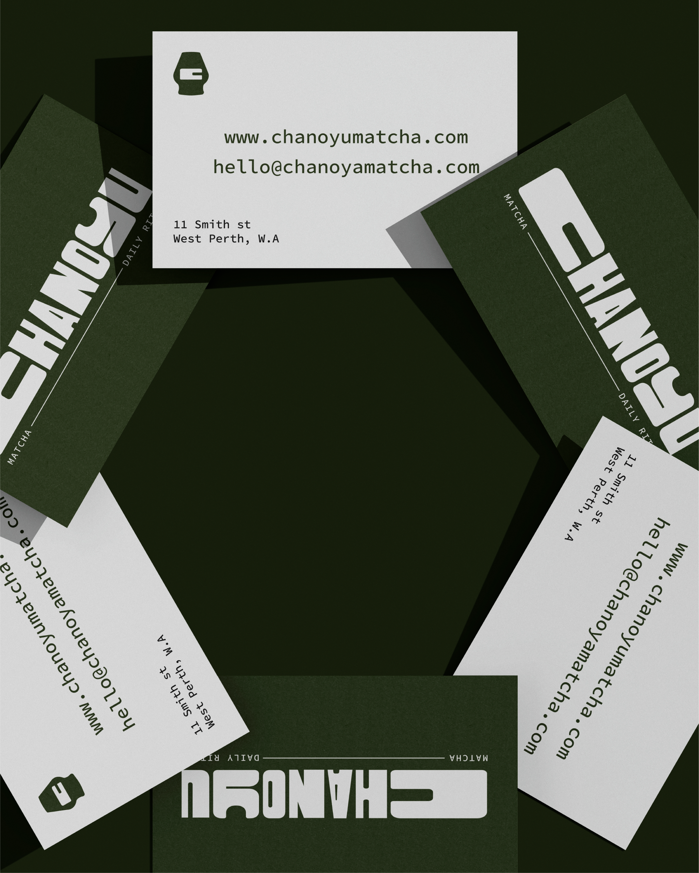
Logo: A refined wordmark and minimal icon were created to reflect the harmony of tradition and modern — timeless, bold, and effortlessly versatile.
Colour Palette: A bold contrast of stark white with deep, grounding greens and vibrant matcha green, accented by a subtle hint of light purple — creating a fresh, energetic vibe that feels both clean and sophisticated.
Typography: A dynamic mix of wide, bold fonts and narrow, refined type — delivering a modern, crafted feel that reflects the brand’s strong yet minimal personality.
Imagery Style: Imagery celebrates the vibrant green of matcha, highlighting the natural textures of both powder and liquid — creating a visual language that feels rich, grounded, and immersive.
The Result?
The result is a bold, vibrant brand identity for Chanoyu Matcha that fuses tradition with modern flair, delivering a visually striking, energetic experience that’s as fresh and dynamic as the matcha itself.


